Visual identity influences how audiences emotionally judge and remember a brand.

Visual identity shapes first impressions before audiences read a single sentence. Colors, typography, imagery, spacing, and layout instantly communicate emotion, personality, and professionalism. Strong visual identity helps brands influence perception with clarity and consistency.
Audiences form opinions within seconds of seeing a brand. Visual presentation immediately communicates whether a brand feels modern, trustworthy, creative, premium, or approachable. These reactions often happen subconsciously before users fully process the content itself.
Strong visual identity helps guide these emotional impressions intentionally.
Colors strongly influence perception and emotional response. Dark tones may create sophistication and confidence, while brighter palettes can communicate energy and optimism. Soft neutral colors often create calmness and elegance.
Effective brands choose colors strategically to align with the emotions they want audiences to experience.
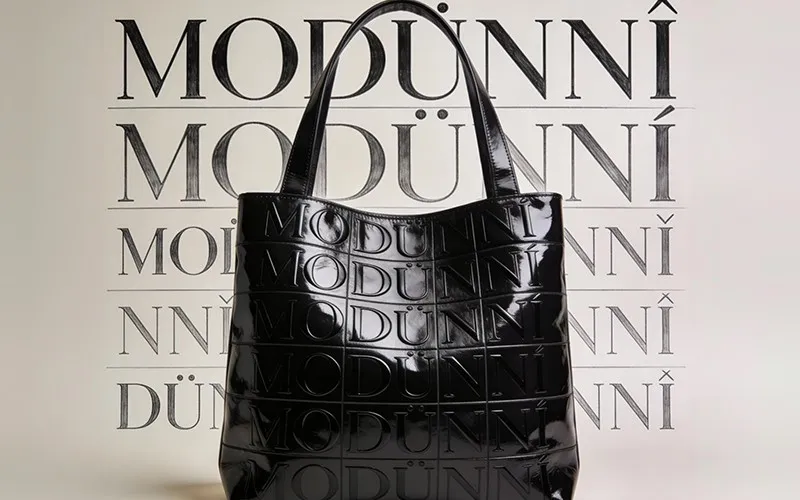
Typography affects readability, mood, and overall brand character. Bold fonts may feel confident and modern, while refined serif typography often communicates sophistication and tradition. Even subtle typographic choices influence how audiences emotionally interpret the brand experience.
Consistent typography strengthens recognition and visual cohesion across every touchpoint.
Photography, illustrations, and visual assets help define the emotional tone of a brand. Minimal visuals may communicate clarity and focus, while expressive imagery can create creativity and energy. Every image contributes to how audiences emotionally experience the identity.
Strong brands use imagery intentionally rather than randomly.
Visual identity becomes more powerful through repetition. When audiences repeatedly encounter the same visual language across websites, social media, campaigns, and products, recognition becomes stronger. Familiarity improves memory while reinforcing professionalism and trust.
Consistency helps transform visuals into recognizable brand signals.
Clear visual structure improves usability and reduces confusion. Clean layouts, intentional spacing, and organized hierarchy make audiences feel more comfortable navigating the experience. Clarity communicates confidence and professionalism while improving overall engagement.
Strong visual systems create smoother and more trustworthy interactions.
Visual identity shapes emotional perception before audiences fully engage with the content itself. Through consistent colors, typography, imagery, and structure, brands create memorable experiences that influence recognition, trust, and emotional connection.
We take on a limited number of projects each quarter. Let's talk before the next spot fills.